Explore a variety of free XLS templates specifically designed for creating area charts in Excel. These templates come pre-loaded with customizable data fields, allowing you to enhance your visual presentations effortlessly. You can quickly input your data, adjust formatting, and generate insightful area charts that highlight trends and comparisons effectively.
Area chart Excel template for sales analysis
💾 Area chart Excel template for sales analysis template .xls
An Area chart Excel template for sales analysis visually represents the changes in sales figures over time, allowing for easy comparison of multiple data series. This type of chart fills the area beneath the lines with color, enhancing the visual impact and making trends more apparent. With this template, you can track sales performance across different periods, identify seasonal trends, and analyze the growth patterns of various products or services. Basic usage includes plotting monthly sales data, while further potential needs may involve integrating advanced analytics features such as forecasting and regression models.
Stacked area chart Excel template for budgeting
💾 Stacked area chart Excel template for budgeting template .xls
A stacked area chart Excel template for budgeting visually represents the composition of your budget over time. Each segment illustrates a specific category, such as expenses, savings, or income, allowing you to observe how these components contribute to your total budget. By stacking the areas, you can easily compare the relative sizes of each category, providing a clear view of your financial distribution. This tool serves not only to track current spending but also to analyze trends and adjust future financial strategies, accommodating advanced methodologies like zero-based budgeting or forecasting techniques.
Area chart Excel template for project timeline
💾 Area chart Excel template for project timeline template .xls
An Area chart Excel template for project timeline visually represents data over a specified period, making it easy to track the progress of a project. It illustrates the cumulative value of different project phases, highlighting milestones and deadlines, helping you assess how much work is completed versus what remains. The filled areas between the lines denote the project's evolution, focusing on trends rather than individual data points, providing an immediate understanding of overall project health. Explore further potential uses such as resource allocation, team performance tracking, or budget monitoring by incorporating advanced features like Gantt elements or conditional formatting for real-time updates.
Monthly trend area chart Excel template
💾 Monthly trend area chart Excel template template .xls
The Monthly trend area chart Excel template visually represents data variations over a specific monthly timeline. This chart type showcases the cumulative magnitude of data, allowing you to easily identify trends, patterns, and fluctuations throughout the year. You can customize various elements such as colors and labels to enhance readability and cater to your specific needs. The basic usage can highlight sales trends or performance metrics, while more advanced applications can include forecasting and predictive analytics for deeper insights.
Area chart Excel template for financial forecasting
💾 Area chart Excel template for financial forecasting template .xls
An Area Chart Excel template for financial forecasting visually represents data trends over a specified time period, making it easier for you to analyze fluctuations in financial metrics, such as revenue or expenses. This type of chart fills the space between the line representing the data and the axis, offering a clear view of the overall performance at a glance. The gradient color effect enhances understanding of the magnitude of changes, helping to illustrate growth or decline more effectively than standard line charts. Basic usage includes displaying historical data and projecting future values, while further potential could explore advanced techniques like layering multiple datasets or applying predictive analytics for deeper insights.
Marketing data area chart Excel template
💾 Marketing data area chart Excel template template .xls
A Marketing Data Area Chart Excel template visually represents marketing metrics over time or different categories. This type of chart allows you to compare multiple datasets by filling the area beneath the lines, providing a clear view of trends and variations. Easily customizable, the template can integrate various marketing KPIs such as sales figures, customer engagement, or advertisement performance. Utilizing this area chart can help you analyze data effectively and assess further potential needs like predictive analytics or segmentation analysis for deeper insights.
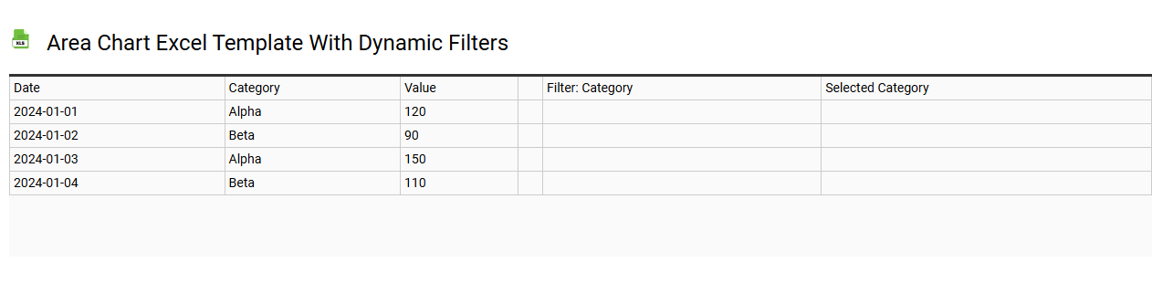
Area chart Excel template with dynamic filters
💾 Area chart Excel template with dynamic filters template .xls
An Area chart Excel template with dynamic filters visually represents data changes over time, using color-filled areas to indicate volume or magnitude. This template allows you to effortlessly illustrate trends, making it easier to interpret fluctuations and patterns in data sets. Dynamic filters enhance your experience by enabling real-time adjustments, so you can focus on specific subsets of your data, such as sales figures by region or product categories. You can leverage this tool to explore simple data visualizations or delve into complex scenarios involving multi-dimensional analyses and predictive modeling.
Simple area chart Excel template for students
💾 Simple area chart Excel template for students template .xls
A simple area chart Excel template is a user-friendly tool designed to visually represent data trends over a period. This chart fills the area beneath the data series with color, effectively highlighting changes and providing a clear picture of performance metrics. Ideal for students, it allows easy input of data, ensuring they can focus on analysis rather than complex charting processes. You can use this template for basic data visualization needs, such as tracking weekly study hours, and can explore advanced features like dynamic data ranges or integrating it with other analytical tools for in-depth insights.
Multi-series area chart Excel template
💾 Multi-series area chart Excel template template .xls
A Multi-series area chart Excel template visually represents multiple data series over time, allowing for easy comparison of trends across different categories. Each area is colored distinctly, creating a layered effect that highlights the cumulative values while maintaining individual series visibility. Users can quickly interpret data fluctuations, making it ideal for analyzing market trends, sales performance, or financial forecasts. This template serves basic needs for visual data representation, with further potential to integrate advanced features like dynamic data filtering or interactive dashboards.
Area chart Excel template for website traffic analysis
💾 Area chart Excel template for website traffic analysis template .xls
An Area chart Excel template for website traffic analysis visually represents data over time, showing total website visits, page views, or unique visitors in a layered format. The colors in the chart help distinguish between different data series, making it easy to track trends and fluctuations in your website traffic. Your audience can quickly grasp performance metrics, see monthly growth, or identify seasonal patterns through this visual representation. This template is not only useful for basic tracking but can also be adapted for advanced analytics, incorporating predictive modeling or segmentation analysis for deeper insights.