Explore a range of free Excel templates designed specifically for bar charts, making it easy for you to visualize your data effectively. These templates allow you to input your numerical data seamlessly, automatically generating bar charts that clearly display trends and comparisons. Choose from various styles, including horizontal and vertical layouts, ensuring your presentation is not only informative but also visually appealing.
Monthly sales bar chart Excel template
💾 Monthly sales bar chart Excel template template .xls
A Monthly Sales Bar Chart Excel template is a pre-designed spreadsheet that allows you to visualize sales performance over a specific period. It features columns for each month, where you can input your sales figures, with the chart automatically updating to reflect any changes in data. This template often includes options for color-coding and labeling to highlight performance trends, making it easier for you to analyze your sales data at a glance. Suitable for businesses of all sizes, it can serve as a foundational tool while offering the potential for more complex analyses, such as forecasting with regression models or creating dynamic dashboards with pivot charts.
Project timeline bar chart Excel template
💾 Project timeline bar chart Excel template template .xls
A Project timeline bar chart Excel template visually represents the sequence and duration of project tasks. This tool organizes information into a clear, linear format, making it easy to track progress and deadlines. Each bar corresponds to a specific task, detailing its start and end dates, ensuring that you can quickly identify overlaps and dependencies. By utilizing this template, you can manage your project more effectively and prepare for advanced project management techniques such as critical path analysis and resource leveling.
Employee attendance bar chart Excel template
💾 Employee attendance bar chart Excel template template .xls
An Employee Attendance Bar Chart Excel template visually represents employee attendance data over a specific period. Each bar corresponds to an employee, highlighting the number of days present, absent, or late. This color-coded chart simplifies tracking attendance patterns and helps identify trends or issues within your workforce. You can further customize this template for more advanced analytics, incorporating metrics like absence reasons or attendance frequency distributions.
Budget comparison bar chart Excel template
💾 Budget comparison bar chart Excel template template .xls
A Budget Comparison Bar Chart Excel template visually represents your budgeted versus actual expenses, empowering you to track financial performance at a glance. This configurable tool allows you to input your income and expenditures, automatically generating bar charts that highlight variances and trends over time. The user-friendly interface ensures you easily interpret data, enabling informed decision-making regarding spending and saving habits. You can use this template for basic budget management, while advanced iterations could incorporate features like predictive analytics and integrated financial forecasting.
Marketing performance bar chart Excel template
💾 Marketing performance bar chart Excel template template .xls
A Marketing performance bar chart Excel template visually represents various marketing metrics, allowing you to analyze and compare performance across different campaigns, channels, or timeframes. This template typically includes customizable data fields, where you can input key performance indicators (KPIs) such as return on investment (ROI), conversion rates, and engagement levels. The bar chart format makes it easy to identify trends and outliers at a glance, enhancing your ability to make data-driven decisions. Such templates provide a foundation for basic data visualization while offering potential for advanced analytics, including predictive modeling and multi-variable analysis.
KPI dashboard bar chart Excel template
💾 KPI dashboard bar chart Excel template template .xls
A KPI dashboard bar chart Excel template visually represents key performance indicators (KPIs) essential for tracking business performance. It utilizes bars to display values across various metrics, enabling quick comparisons and assessment of trends over time. Each bar corresponds to a specific KPI, giving you an immediate understanding of how each metric stands in relation to your goals. This template serves basic usage for monitoring performance and has potential for advanced features such as dynamic data sourcing and predictive analytics integration.
Inventory tracking bar chart Excel template
![]()
💾 Inventory tracking bar chart Excel template template .xls
An inventory tracking bar chart Excel template provides a visual representation of stock levels over time. You can easily track the quantities of different items, enabling you to identify trends in sales or restocking needs. The template typically includes data inputs for item names, quantities, and status, which generates a bar chart that illustrates how stock levels fluctuate. This tool simplifies inventory management, catering to basic monitoring and offering potential for advanced forecasting, such as utilizing predictive analytics or integrating with supply chain management systems.
Yearly expenses bar chart Excel template
💾 Yearly expenses bar chart Excel template template .xls
A Yearly Expenses Bar Chart Excel template provides a structured way to visualize your annual spending in a clear and concise manner. This template typically includes categories of expenses, such as housing, transportation, groceries, and entertainment, each represented by a distinct bar that indicates the amount spent over the year. Color-coded bars make it easy for you to identify the highest and lowest spending categories at a glance. This tool is beneficial for managing finances, allowing you to track spending patterns and plan for future budgets, potentially leading to advanced analysis such as variance reports and forecasting trends.
Survey results bar chart Excel template
💾 Survey results bar chart Excel template template .xls
A Survey results bar chart Excel template visually represents data collected from surveys, making it easier to analyze responses. This template organizes information into clear, color-coded bars that display the frequency or percentage of each answer category. You can customize the chart by changing colors, adding labels, or adjusting scales to match your specific survey data. Basic usage includes simple data entry and chart generation, while further potential needs may involve advanced statistical analysis or integration with other data visualization tools.
Progress report bar chart Excel template
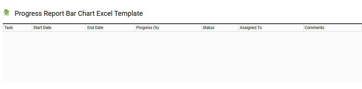
💾 Progress report bar chart Excel template template .xls
A Progress Report Bar Chart Excel template visualizes the progress of tasks or projects using horizontal bars, making it easy to compare performance over time. Each bar represents a specific task or milestone, with its length indicating the level of completion, helping you quickly assess which areas are on track and which need attention. The template can be customized with different colors and labels to align with your project's theme or requirements. You can use this template for basic tracking or expand its functionality to include more advanced features like automated data updates and interactive dashboard elements.