Explore a collection of free XLS templates designed specifically for creating Pareto charts in Excel. These templates come pre-formatted with data input sections and graphical representations, allowing for easy customization to fit your specific data needs. Utilize these user-friendly templates to visualize the most significant factors affecting your project or analysis, ensuring you focus on what truly matters.
Pareto chart analysis Excel template
💾 Pareto chart analysis Excel template template .xls
A Pareto chart analysis Excel template is a specialized tool designed to visually represent data, highlighting the most significant factors in a dataset. This chart combines bars and a line graph, where the bars illustrate individual category frequencies while the line shows the cumulative total. Often used in quality control and business analysis, it helps identify areas needing improvement by focusing on the 80/20 rule--where 80% of effects come from 20% of causes. This template proves valuable for analyzing patterns in customer complaints or production issues, while more advanced users might explore dynamic data modeling or integration with machine learning approaches.
Pareto chart example Excel template
💾 Pareto chart example Excel template template .xls
A Pareto chart in Excel visually represents the frequency of problems or causes, allowing you to prioritize which issues to address first. This chart typically combines a bar graph and a line graph; the bars display individual categories in descending order, while the line graph shows the cumulative percentage of the total. For instance, if you're analyzing defects in a production process, categories such as "manufacturing errors," "packaging mistakes," and "shipping delays" appear along the x-axis. You can use a Pareto chart template in Excel to efficiently organize your data and gain insights into prioritizing improvements or solving specific challenges, potentially leading to concepts like Six Sigma or root cause analysis in advanced applications.
Dynamic Pareto chart Excel template
💾 Dynamic Pareto chart Excel template template .xls
A Dynamic Pareto chart Excel template is a powerful tool designed to visually represent data sets, highlighting the most significant factors contributing to a particular problem or outcome. This template allows you to easily rearrange data inputs, making it adaptable as your analysis needs change. By taking advantage of Excel's features like charts and filters, you can monitor and assess critical metrics in real-time. You can utilize this template for basic analysis, while further sophisticated needs might involve applying statistical techniques such as regression analysis or machine learning models for deeper insights.
Editable Pareto chart Excel template
💾 Editable Pareto chart Excel template template .xls
An Editable Pareto chart Excel template provides a structured format for visualizing data in a way that emphasizes the most significant factors contributing to a problem or outcome. This tool allows you to easily input and modify datasets, instantly generating a bar chart alongside a line graph to illustrate cumulative percentages. You can identify key areas for improvement by focusing on the "vital few" versus the "trivial many." For effective data analysis and decision-making, this template can be utilized not only for quality control but also for advanced statistical applications like Six Sigma and root cause analysis.
Free Pareto chart Excel template
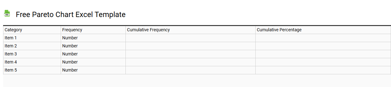
💾 Free Pareto chart Excel template template .xls
A Free Pareto Chart Excel template is a pre-designed spreadsheet that helps you create Pareto charts efficiently. These charts visually represent the most significant factors in a dataset, typically based on the Pareto Principle, which states that 80% of effects come from 20% of the causes. This template allows you to input your data, helping you identify the key issues that require attention. You can leverage this tool for basic analysis or expand its functionality to include complex statistical analyses, such as regression modeling or root cause analysis.
Quality control Pareto chart Excel template
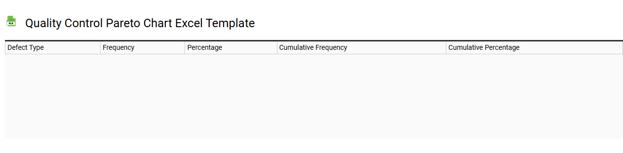
💾 Quality control Pareto chart Excel template template .xls
A Quality Control Pareto Chart Excel template visually displays the frequency of defects or issues in a process, helping to identify the most significant problems that require attention. This chart, based on the Pareto principle, allows you to prioritize your quality control efforts by emphasizing the 20% of issues that contribute to 80% of the problems. The template includes easily customizable data input fields and automatic chart generation, streamlining the analysis process for your quality improvement initiatives. By using this tool, you can effectively monitor and address common defects, leading to more advanced methodologies like Six Sigma or root cause analysis for optimal quality management.
Pareto analysis report Excel template
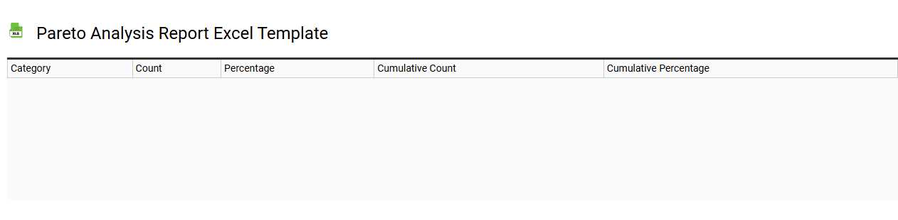
💾 Pareto analysis report Excel template template .xls
A Pareto analysis report Excel template is a structured framework designed to help you identify and prioritize problems based on their impact. This template typically includes charts and tables that represent the 80/20 rule, showcasing that 80% of results come from 20% of the causes. By organizing data into categories, you can visually see which issues most significantly affect performance or quality. You might find it useful for initial assessments, but as you advance, exploring regression analysis or predictive modeling can further enhance your decision-making processes.
Automated Pareto chart Excel template
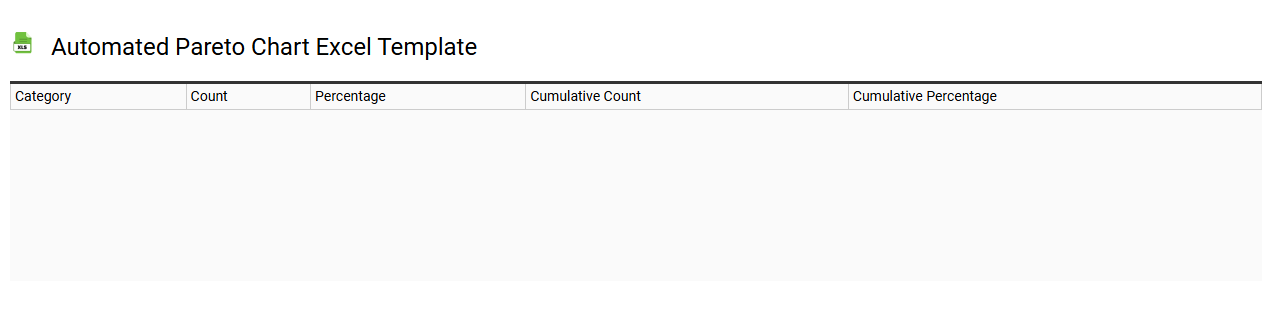
💾 Automated Pareto chart Excel template template .xls
An Automated Pareto chart Excel template simplifies the creation of Pareto charts, which visually represent the most significant factors in a dataset. This template automatically organizes your data, generating a bar chart that highlights the frequency of issues or causes, complemented by a cumulative line graph that illustrates their impact. You can easily input your data into designated cells, and the template will update the chart in real-time, allowing for quick visual analysis. For basic usage, it aids in identifying key problem areas, while advanced applications may include integrating sophisticated statistical analyses or applying predictive modeling techniques.
Simple Pareto chart Excel template
💾 Simple Pareto chart Excel template template .xls
A Simple Pareto Chart Excel template visually represents data in a way that highlights the most significant factors impacting a particular outcome. It combines a bar graph and a line graph, where the bars display the frequency or impact of issues in descending order, while the line represents the cumulative percentage of the total. This format helps you identify the "vital few" causes that contribute to the majority of the problems, enabling focused improvement efforts. You can use this template for various applications, from analyzing sales data to assessing customer complaints, but it can also be extended for complex statistical analyses and advanced decision-making scenarios, such as Six Sigma projects or process optimization initiatives.
Pareto chart with cumulative percentage Excel template
💾 Pareto chart with cumulative percentage Excel template template .xls
A Pareto chart is a specialized bar graph that visually represents data in a descending order, showcasing the most significant factors in a dataset. Within the chart, each bar indicates the frequency or impact of an issue, while a cumulative percentage line illustrates the combined total, highlighting the proportion each factor contributes to the overall problem. You can quickly create a Pareto chart using an Excel template, which streamlines the process of data analysis and provides a clear visual reference. This tool is especially beneficial for identifying areas for improvement, allowing you to prioritize efforts effectively based on the 80/20 rule, enabling further exploration of process optimization techniques and quality control measures.