Discover a selection of free XLS templates tailored for creating stacked bar charts in Excel, perfect for visualizing your data trends effectively. These templates offer customizable formats that simplify data entry, ensuring you can clearly present different categories within a single bar, making comparisons more insightful. Utilize these resources to enhance your reports and presentations, allowing your audience to grasp complex information at a glance.
Stacked bar chart Excel template for sales analysis
💾 Stacked bar chart Excel template for sales analysis template .xls
A stacked bar chart Excel template for sales analysis visually represents different categories of sales data, showcasing how each segment contributes to the total. Each bar is divided into colored sections, with each section representing a specific product, region, or time period, allowing easy comparison among multiple categories. Your analysis can reveal trends, highlight top-performing products, and identify areas needing improvement at a glance. Such templates are especially useful for tracking sales performance over time but can also evolve into sophisticated visualizations including multiple dimensions and predictive analytics models.
Stacked bar chart Excel template for project management
💾 Stacked bar chart Excel template for project management template .xls
A Stacked Bar Chart Excel template for project management visually represents data by stacking different categories or project components within a single bar. This template allows you to compare various tasks or project phases while providing insight into progress or resource allocation over time. Each segment within the bar corresponds to a specific category, making it easier to identify how much of the total each segment contributes. With this tool, you can effectively track project milestones and resource distribution, which can be expanded further to include advanced metrics like earned value management and critical path analysis.
Stacked bar chart Excel template with data labels
💾 Stacked bar chart Excel template with data labels template .xls
A stacked bar chart Excel template presents quantitative data in a visually layered format, allowing you to compare different categories of data effectively. Each bar in the chart is divided into several segments, representing various sub-categories within the main category. Data labels are included on each segment to provide precise values, enhancing clarity and facilitating analysis. You can leverage this template for basic data visualization needs or explore advanced features like dynamic data ranges and interactive elements to enrich user engagement.
Monthly stacked bar chart Excel template for budget tracking
![]()
💾 Monthly stacked bar chart Excel template for budget tracking template .xls
The Monthly Stacked Bar Chart Excel template for budget tracking visually represents your expenses and income over a set period, typically a month. Each bar in the chart is divided into segments that correspond to different budget categories, such as utilities, groceries, and entertainment, allowing you to see how much you spend in each area at a glance. Colors are used to differentiate each category, making the chart not only informative but also visually appealing and easy to interpret. This tool can enhance your financial planning, providing insights into your spending habits and helping you adjust future budgets based on previous performance. For basic usage, you can easily input your data into the template, and it will automatically generate the chart. As your needs evolve, you might explore advanced features like dynamic data ranges and predictive analytics to refine your budget tracking further.
Stacked bar chart Excel template for survey results
💾 Stacked bar chart Excel template for survey results template .xls
A Stacked Bar Chart Excel template for survey results visually represents data by layering different categories within each bar, allowing you to easily compare multiple groups. Each segment in a bar corresponds to a specific category, showing how individual responses contribute to the total for each survey question. This format not only highlights the composition of responses but also emphasizes the magnitude of each category, making it clearer to identify trends and preferences. You can customize colors and labels to enhance clarity and ensure your survey results are presented effectively, while further potential needs may include advanced techniques like multi-dimensional analysis or interactive dashboards for deeper insights.
Stacked bar chart Excel template for financial comparison
💾 Stacked bar chart Excel template for financial comparison template .xls
A stacked bar chart Excel template serves as a powerful tool for visualizing financial comparisons across multiple categories. Each segment within the bars represents different financial components, such as revenue streams or expense categories, allowing you to see both the total value and the individual contributions at a glance. This format not only clarifies data relationships but also highlights trends over time, enabling better decision-making. You can easily customize these templates to suit your analysis, whether you're tracking quarterly performance or assessing budget allocations, with the potential to explore advanced analytics like variance analysis or forecasting.
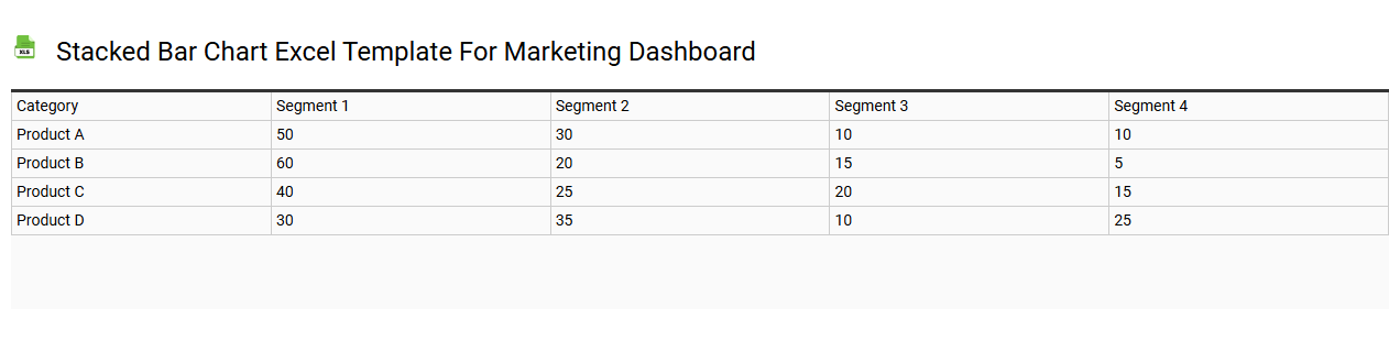
Stacked bar chart Excel template for marketing dashboard
💾 Stacked bar chart Excel template for marketing dashboard template .xls
A stacked bar chart Excel template for a marketing dashboard visually represents multiple data series, allowing you to compare different categories simultaneously. Each bar is divided into segments that represent values of different subcategories, enabling easy identification of the contributions to the total. For instance, you can illustrate marketing performance across various channels, such as social media, email, and SEO efforts, showcasing how each contributes to overall results. This template is essential for tracking marketing KPIs and can be further enhanced by incorporating intricate data analytics and predictive modeling techniques.
Horizontal stacked bar chart Excel template
💾 Horizontal stacked bar chart Excel template template .xls
A horizontal stacked bar chart Excel template presents a visual representation of data through horizontally arranged bars, allowing for effective comparison of various categories side by side. Each bar is divided into segments, with each segment representing a part of the whole, making it easy to observe the contribution of different data series. This type of chart excels in showcasing relationships between multiple items, especially when dealing with cumulative data, such as sales figures or survey results. You can easily customize this template in Excel to suit your needs, enabling better insights or advanced visualizations like stacked area charts or interactive dashboards.
Stacked bar chart Excel template for KPI reporting
💾 Stacked bar chart Excel template for KPI reporting template .xls
A Stacked Bar Chart Excel template for KPI reporting visually represents key performance indicators (KPIs) by breaking down data into different segments. Each bar is divided into sections that reflect various categories or contributors, allowing you to compare performance metrics effectively. The color-coded segments enhance readability, making it easier to identify trends and areas needing improvement. You can customize the template to suit your specific KPIs and even enhance it with advanced features such as dynamic charts or integration with Power BI for more comprehensive analytics.
Stacked bar chart Excel template for inventory analysis
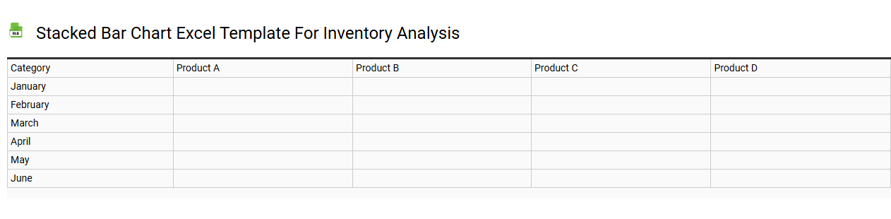
💾 Stacked bar chart Excel template for inventory analysis template .xls
A Stacked Bar Chart Excel template for inventory analysis visually represents the composition of different inventory categories over time or across various product lines. This chart allows you to compare multiple items within the same category, such as different types of products or storage locations, highlighting their contributions to the overall inventory. Colors differentiate each category, making it easy to identify changes and trends in your inventory levels. This tool not only aids in data visualization but can also serve as a basis for further analysis, such as identifying seasonal trends or projecting future inventory needs using advanced forecasting techniques.